The Challenge
The Challenge
The skincare market is highly saturated, especially within the natural and wellness-focused beauty space. Many brands rely on similar visual trends, such as minimalist layouts, soft neutrals, and generic botanical imagery. This makes differentiation increasingly difficult.
Kitao needed a visual identity that could:
Feel premium without becoming sterile or clinical
Communicate natural ingredients and wellness authentically
Reference Japanese aesthetics without feeling performative or overly traditional
Appeal to modern skincare consumers across both Eastern and Western markets
Create a recognizable visual language that could scale as the product line expanded
The challenge was balancing elegance and restraint while still building a brand that felt distinctive on shelves and in digital environments.



Typography
Typography
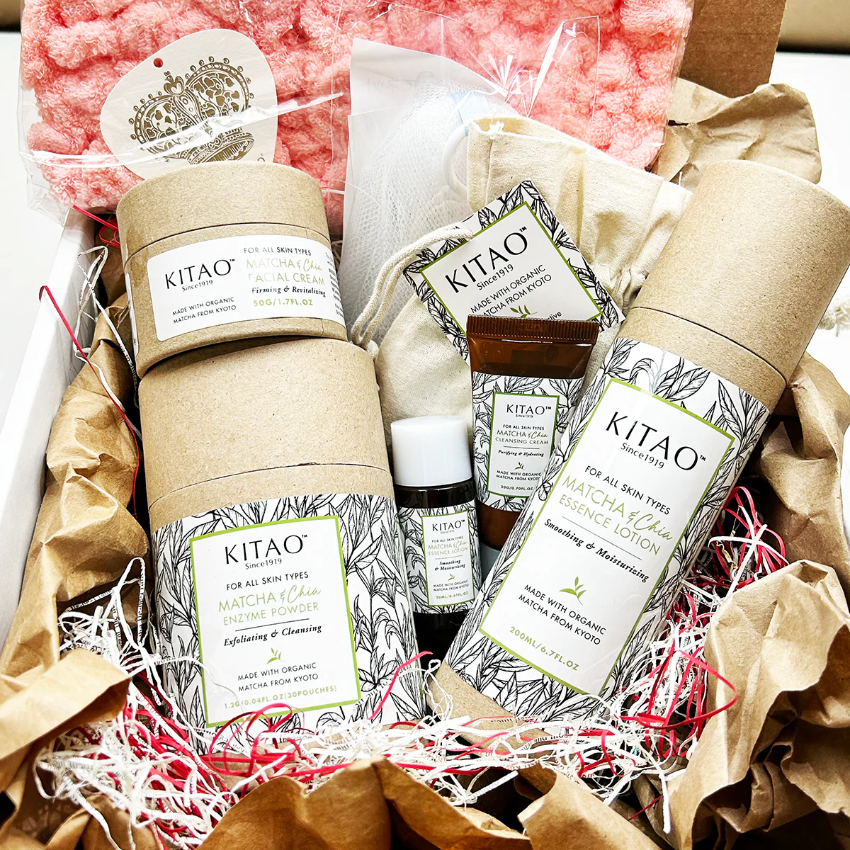
The chosen type system balanced elegance and readability while reinforcing the calm, elevated feeling of the brand.
The typography direction emphasized:
Thin and breathable layouts
Sophisticated serif pairings
Editorial-inspired hierarchy
Minimal visual clutter
A balance between luxury and accessibility
The overall goal was to create a visual cadence that felt quiet and refined rather than loud or aggressively commercial.


Color Palette
Color Palette
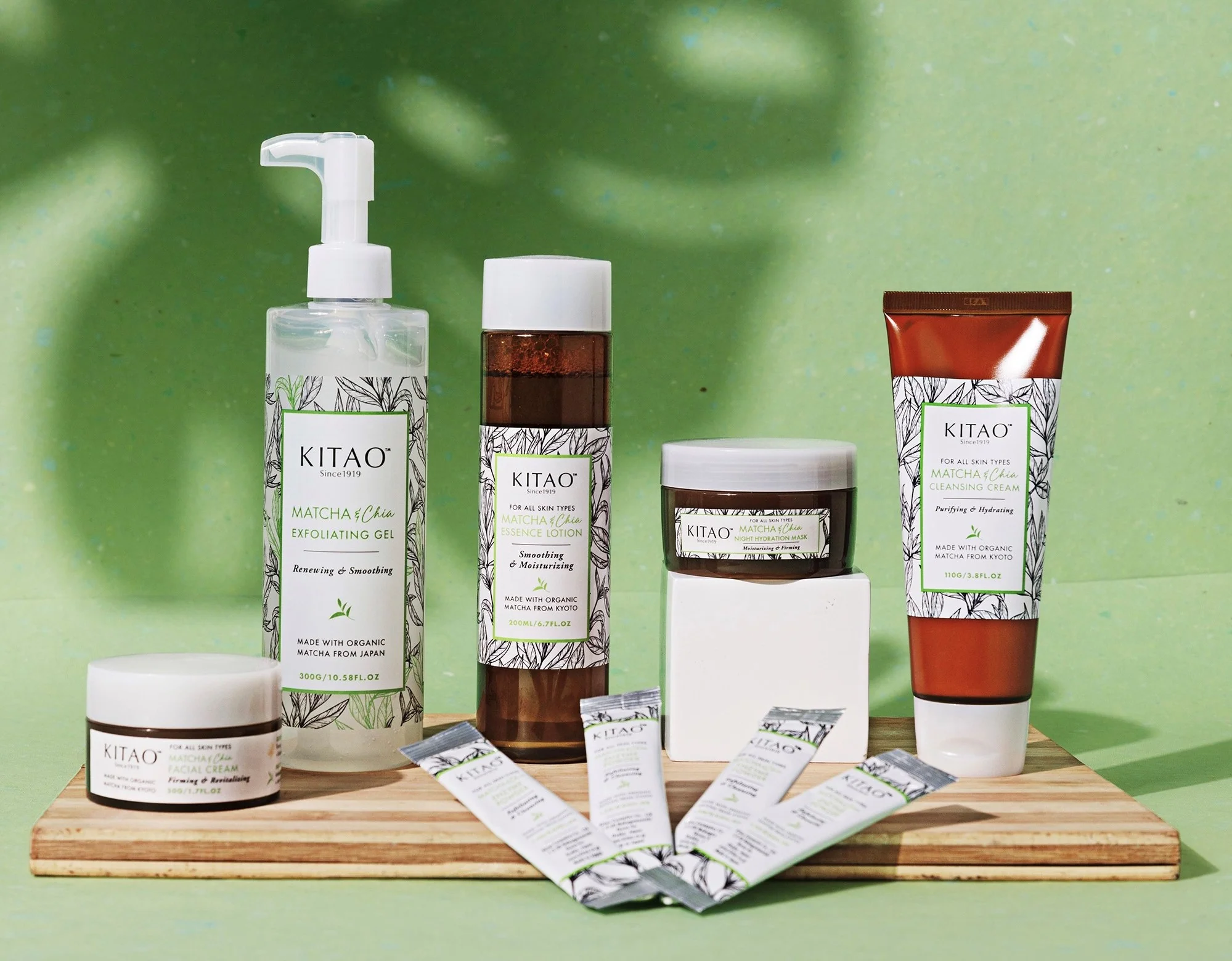
The color system centered around muted greens, natural neutrals, and earthy tones inspired directly by matcha, tea leaves, stone textures, and organic materials.
The palette was intentionally restrained to maintain consistency and reinforce the premium wellness positioning.
The muted green tones became especially important in helping the brand feel recognizable while still remaining subtle and elegant.

Outcome
Outcome
The final identity system gave Kitao Cosmetics a cohesive and recognizable visual language rooted in calmness, nature, and modern Japanese-inspired aesthetics.
The branding helped position the company within the premium skincare space while differentiating it from more generic wellness brands through stronger art direction, restrained design choices, and a more atmospheric visual identity.
The resulting system was flexible enough to scale across:
Packaging
E-commerce
Social media
Marketing campaigns
Product photography
Future product launches
You can view the live website for the brand here: https://kitaomatcha.com/
You can also view the full branding guidelines I created here: https://www.dropbox.com/scl/fi/ag67tyiaxe1snlq4hqqvl/Kitao-Cosmetics_Branding-Guidelines.pdf?rlkey=4tvez424kn61bpqbrb5if29jk&dl=0
Next projects.
(2016-2025)