The Problem
The challenge wasn’t a lack of functionality but rather, it was the opposite. IES needed to communicate a large surface area of features spanning financial reporting, payroll, HR, and cash flow across multiple business entities.
Users were expected to navigate dense datasets, often switching between entities dozens of times per session, while maintaining accuracy in high-stakes financial environments.
The core issue wasn’t capability but instead clarity. The platform lacked a cohesive system for presenting information, making workflows harder to interpret, repeat, and trust.

Approach and Strategy
Rather than redesigning the platform from scratch, I focused on introducing structure to an already complex system.
The strategy centered on three principles:
Reinforcing context across multi-entity workflows
Reducing cognitive load in data-dense environments
Systematizing UI patterns to scale across the product
Solutions needed to work within existing constraints while aligning with Intuit’s broader design standards, ensuring they could be adopted across multiple teams and features.

Process & Solution
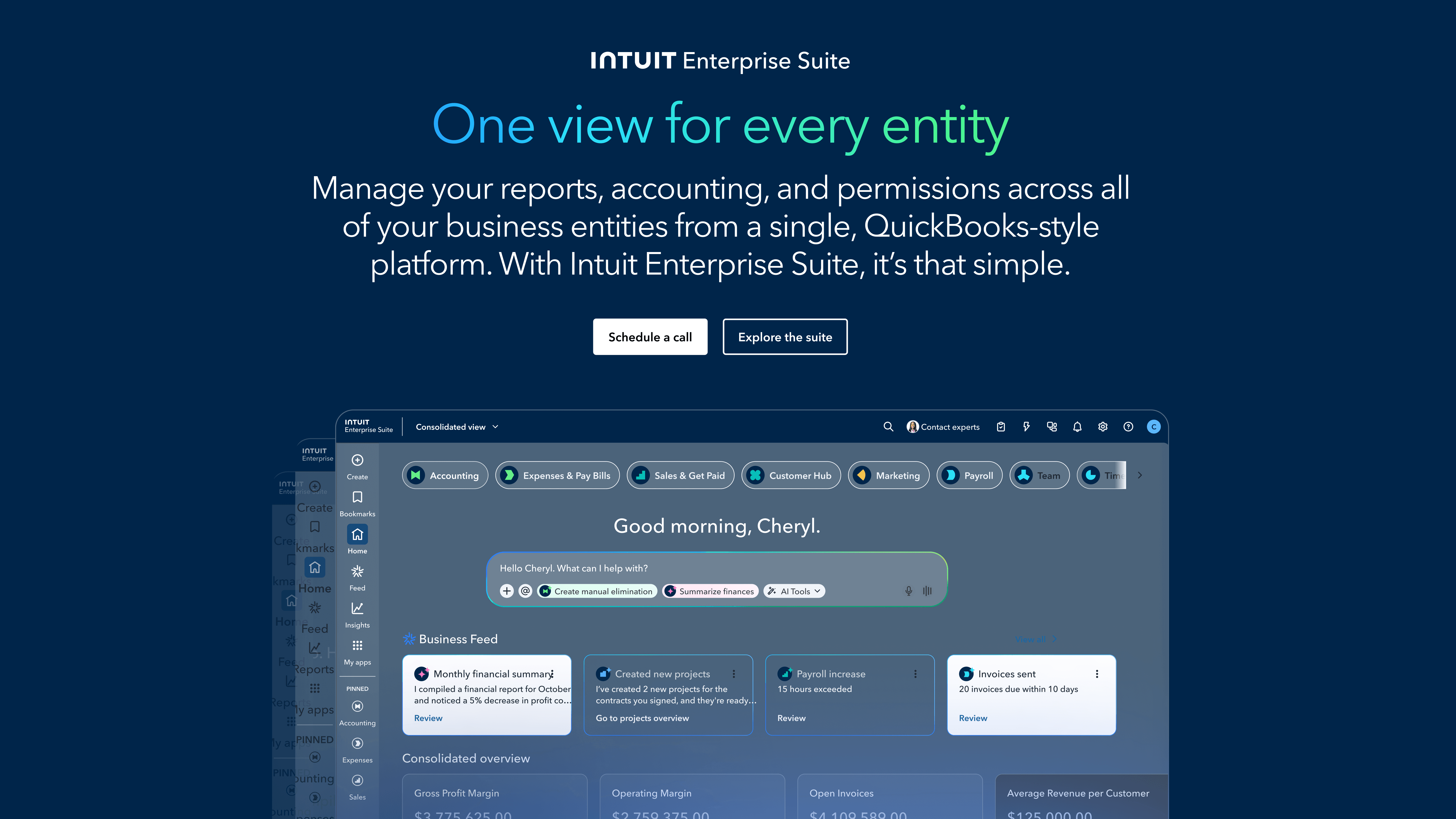
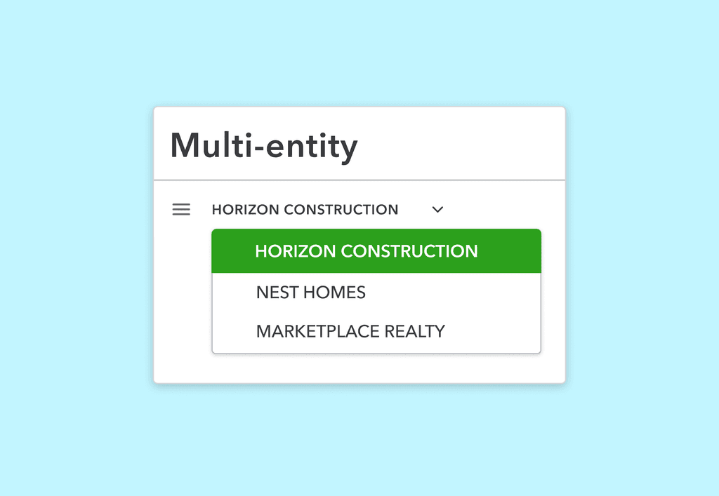
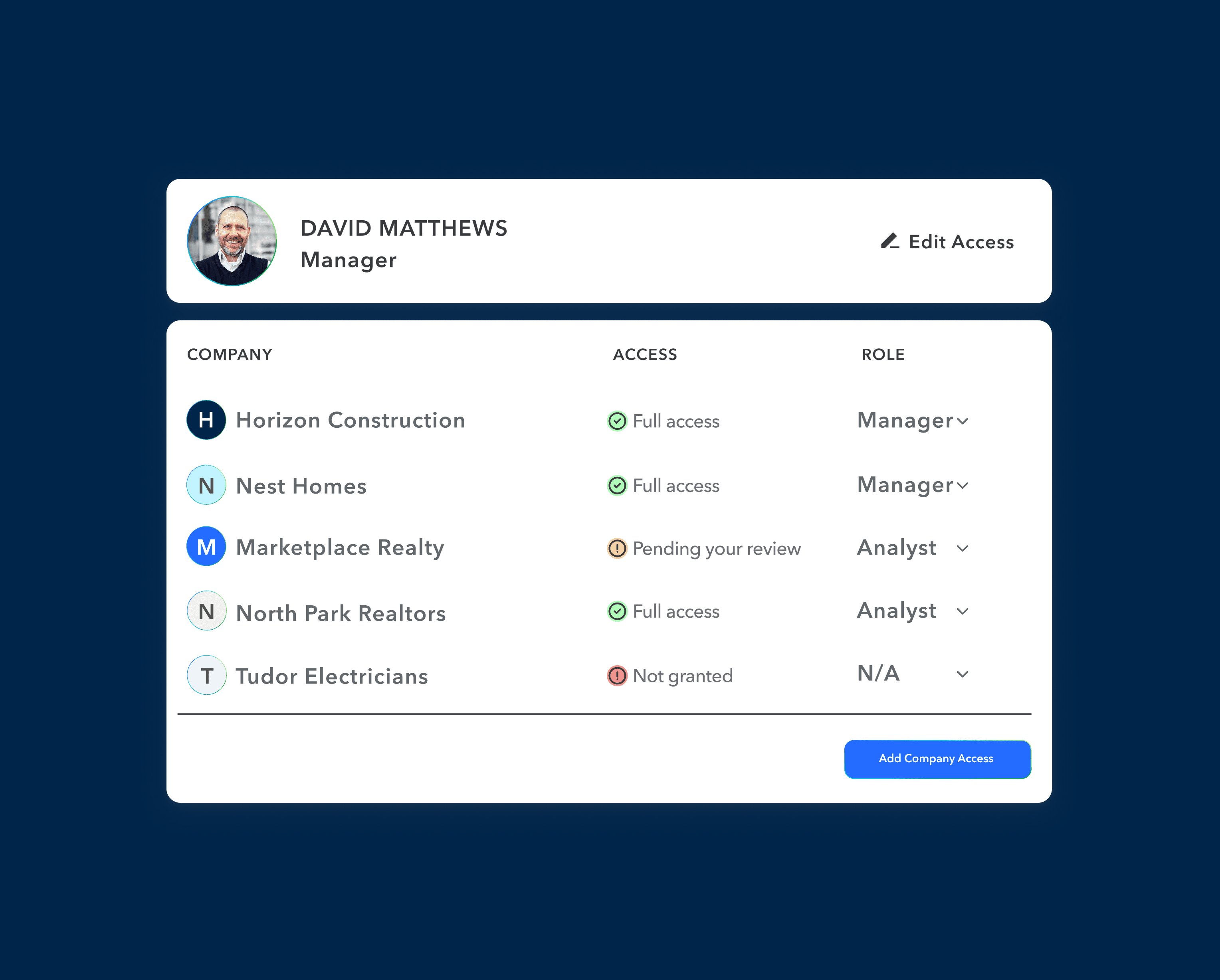
A major priority was reinforcing entity context, ensuring users always had a clear understanding of which entity they were working within.
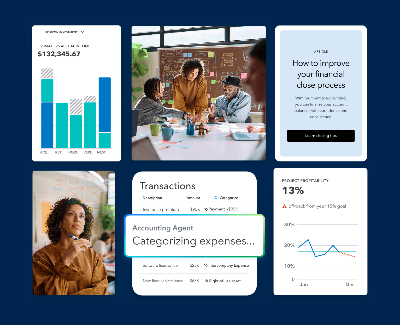
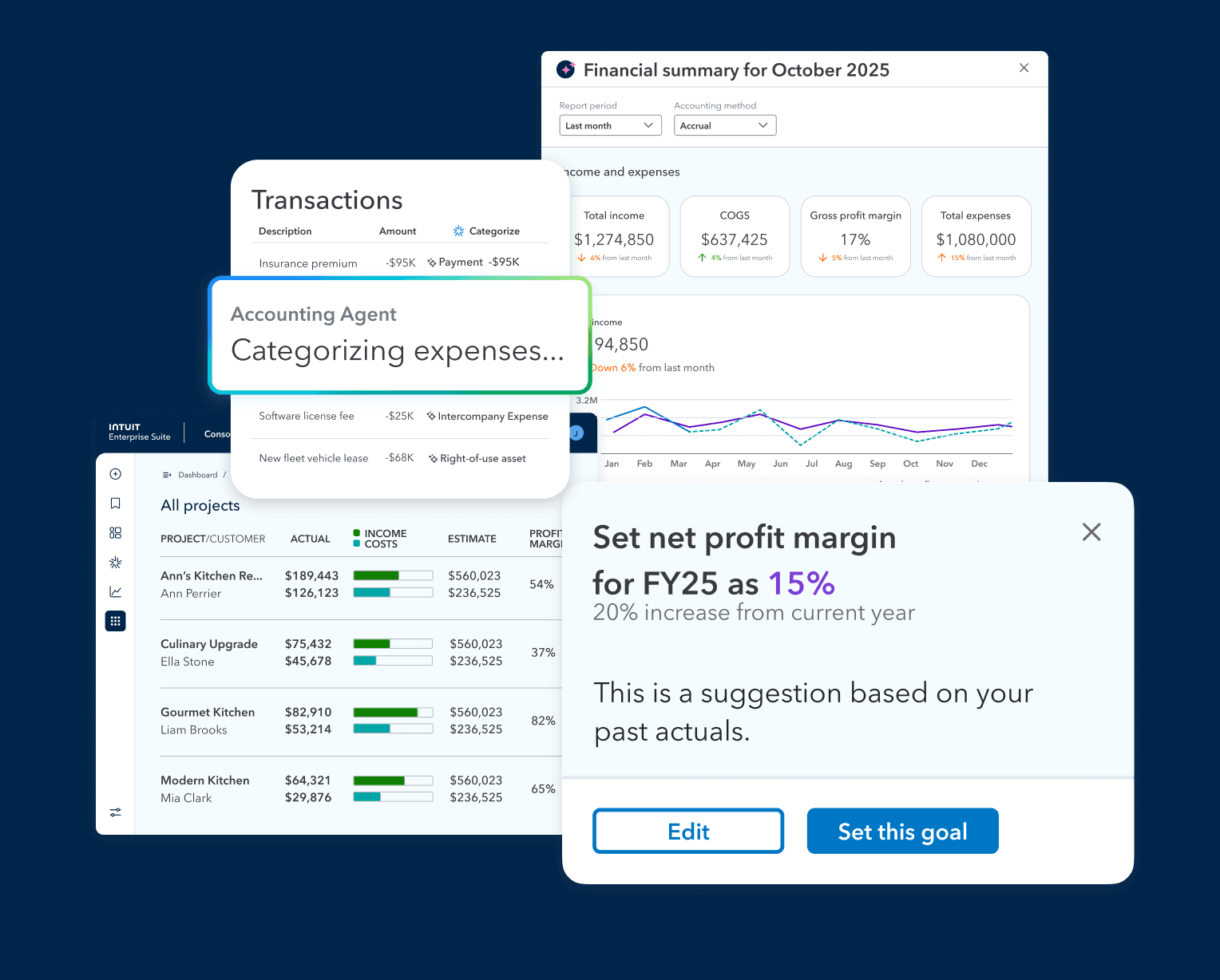
This was achieved through more persistent and visible indicators integrated consistently across the interface. Data-heavy views were restructured to improve hierarchy and readability, using typography, spacing, and grouping to make complex information easier to scan and interpret.
Instead of reducing data, the design made it more digestible and actionable.
The Results
I focused on high-impact areas rather than following a rigid UX sequence, prioritizing components that appeared most frequently across workflows.
Entity Context:
Introduced persistent indicators and reinforced placement patterns to ensure users always understood which entity they were operating within, reducing context-switching errors.
Data Systems:
Restructured dense tables using improved hierarchy, spacing, and grouping, enabling faster scanning across large datasets without reducing information density.
Navigation Patterns:
Developed layered navigation systems and multi-entity selectors designed to scale across different product areas while maintaining consistency.
These changes transformed how information was consumed by shifting from overwhelming data surfaces to structured, actionable interfaces.

Next projects.
(2016-2025)


